
French Curves Bared at R.B. Stevenson Gallery
Undulating forms executed with the precision of an architectural rendering become mandala-like “très belles fleurs” (very beautiful flowers) in paintings by Ricardo Xavier. He creates his ornate canvases by using draftpersons’ French curves and meticulous craft fused with vivid hues in an exhibition entitled “Kinetic Contrasts” now on exhibit at R.B. Stevenson Gallery in La Jolla.
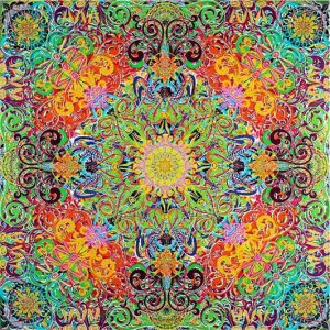
RICARDO XAVIER
“Looking Forward”; 2013.
Acrylic on canvas; 60 x 30 inches. Image courtesy of the the artist and R.B. Stevenson Gallery.
He has exhibited widely in South America and recently moved to San Diego. Although Xavier’s education was actually in business, he traded-in his calculator to become an artist. He is mostly self-trained and this might explain his repeated use of symmetry in his past works. The shapes of his large scale compositions have traditionally been either circles or squares. While working on mastering his exacting silkscreen techniques to apply his paint, the artist has relied on rigorous radial symmetry in his tondi or bilaterally reflected symmetry in his square works. This is not unusual in non-artists or self-trained artists because the formula for such compositions give predictably pleasing results.
Using a bright 1960s flower power palette in most of his paintings, twenty-seven of Xavier’s paintings on exhibition are 14-inch circles. Two are squares: one is 48-inches and the other is 60-inches. Two other paintings are large rectangles. The rectilinear paintings feature layer-upon-layer of drafted flower shapes that have been silkscreened onto a smooth canvas. Many of the screened layers are intentionally off-register, which create either a drop shadow effect or allow the white of the ground to show through. This slight imperfection also creates different interactions of color that affect the appearance and quality of identical hues, technically referred to as color assimilation or simultaneous contrast depending on the contextual hue relationship. The repeated layering of the overlapping hues also reinforce illusions of spacial depth beyond the surface of each painting.
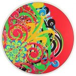
RICARDO XAVIER
“Round Variation # 28”; 2013.
Acrylic on wood panel; 14 in round. Image courtesy of the artist and R. B. Stevenson Gallery.
The larger of the two square paintings is especially successful in controlling this illusion of depth. With the title Looking Forward (2013), Xavier employed tinted hues in the center of the work, which appear to recede in space. Then he gradually increased the saturation level of the hues toward the outward edges creating a grand illusion of a concave surface.
Fortunately, the newer paintings in the exhibition are beginning to enjoy more asymmetrical complexity. As one views all of the twenty-seven tondi, one can see Xavier’s evolving exploration into this territory. In a left to right reading of these twenty-seven works, the culminating Round Variation # 28 (2013), reveals a very fruitful effort. The floral design has drifted left from the center of circle leaving a larger red field on the right side. The visual texture of the multi-hued flowers are acutely balanced against the weight of the intense red. This experiment carries over into Xavier’s new large scale rectangular paintings.
[php snippet=1]
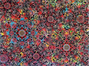
RICARDO XAVIER
“How to Use 140 Hours of Your Life”; 2014.
Acrylic on canvas; 72 x 96 inches.
Image courtesy of the artist and R. B. Stevenson Gallery.
The new rectangular paintings feature busy fields of programmatic floral designs that become even more complex patterns of his usual design vocabulary. Instead of the target-like bilaterally reflected compositions, the newer ones have multiple focal points that better pull one’s eye around the entire painting’s surface. Xavier’s new painting How to Use 140 Hours of Your Life (2014) also features a chromatic black within the matrix of hues. The black transforms the overall painted field from flower power into a more powerful color range that further enriches the vividness of the hues. This phenomenon is historically indebted to 19th-century French chemist Michel Eugène Chevreul’s experiments in hue and value relationships, which he published in his famous book The Principles of Harmony and Contrast of Colors and Their Applications to the Arts (1860).
Ricardo Xavier’s exhibition “Kinetic Contrasts” displays the artist’s continued evolving step-by-step growth, but one might wish for greater strides or perhaps more of “a jump to the left. And a step to the right” warp in his progress as an artist. “Kinetic Contrasts” continues through March 29th.
(“Kinetic Contrasts”: 22 February through 29 March at R.B. Stevenson Gallery, 7661 Girard Ave #201, La Jolla, CA 92037)

Kraig Cavanaugh lectures about art history—specializing in Modern & Contemporary Art—as well as being an instructor of color theory, design, and studio art. He has curated numerous art exhibitions, authored exhibition catalogues, and written art reviews for several other print and online journals including “Artweek” (USA) and “Selvedge” (UK) magazines. Cavanaugh is also an invited member of the Association Internationale des Critiques d’Art (United States division), which is an NGO in official relations with UNESCO.