Artworks Save Themselves In Central Library Exhibition
Artists can spawn either extraordinary aesthetic objects or spew demonically hilarious irony. Rather than being a noose or an old ball and chain, an artist’s spouse who is also an artist can be either an intellectual collaborator or an intense competitor who can bring-up the other spouse’s own game. “Significant Others” is a robust art exhibition now on display at the downtown Central San Diego Public Library’s (SDPL) 9th-floor Art Gallery. This is due to the majority of artworks on display. The exhibition runs through February, 28th, 2016.

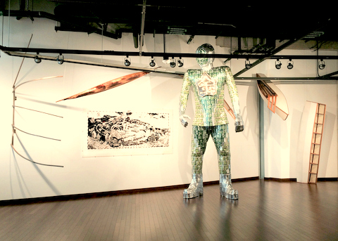
Debby and Larry Kline; “The Alchemist and His Junks,” 2015.
Mixed media installation; variable dimensions.
Image (C) 2015 by Debby and Larry Kline. Image courtesy of the artists.
The exhibition intentionally features four sets of married heterosexual couples. This unfortunately casts both layers of conservative gloom and cultural myopia over curator Kara West’s exhibition. The four artist couples included are Anna O’Cain & Richard Keely, Debby & Larry Kline, Jean Lowe & Kim MacConnel, and Jessica McCambly & John Oliver Lewis. Worthy of viewing are a huge installation, some oddball objects, and some teensy-weensy paintings. The works on display are very dissimilar and unique.
An art installation created by the dynamic husband and wife duo Debby & Larry Kline titled “The Alchemist and his Junks” (2015) makes a large impact by both its huge physical size and serious absurd ironic truths. Their work starts from combining two primary ideas: the mysteries of alchemy and the unwanted debris created in the aftermath of failed alchemical hocus-pocus, i.e.: junk. The word “junk” has many meanings including nouns such as the classic Chinese sailing vessel and “useless objects with little value” and can also function as verbs, too. In this fashion, the Klines continue their free association to magically transform that word into a series of free associations.
Standing in front of a detailed map of the Pacific Ocean is an over twelve-foot tall Han dynasty warrior wearing a super hero’s helmet. With this colossal figure, the Klines have managed to pull off real alchemy at its best as the figure is made entirely of recycled components. The colossus is covered with jade colored armoring made of rectangles cut from recycled aluminum cans of Perrier Lime Flavored Sparkling Mineral Water, which were designed in a deep green hue. The giant helmeted figure also wears a chest plate made of lead featuring the Chinese character for gold, referring to the quest of historic alchemists aspiring to alter base lead into the precious metal similar to how the Klines have repurposed the cast-off aluminum cans. The giant figure is perhaps both superhero and super villain. Is he “Recycle Man” with alchemical super powers?
The hub of the installation is a well rendered, hand drawn black & white map of the Pacific Ocean mounted on the wall behind the colossal Alchemist figure. The map is flanked by both the Asian and North American continents but awash both with the debris of Great Pacific Garbage Patch as well as several types of sailing cargo vessels—from container ships to Chinese junks.
Other such effluent as floating cola cans, plastics, a Warholian Brillo box, and many other odds and ends are depicted. A floating junked space satellite flies high above the Pacific cesspool, and mythic rubbish such as Sasquatch and sea monsters are also prominently rendered. In the map’s center, an ambivalently gestured outstretched arm reaches up from of the flotsam filled ocean. Is the arm from a figure that is part of, drowning in, or trying to rise above all the various types of junk?
Other features of the installation include several variations of one-third scale Inuit umiaks (open boats used for moving family and possessions and whaling) suspended above and flanking the installation. The umiaks, for better or worse, are covered in common canvas rather than traditional authentic seal skins. Are the umiaks here to carry away the ocean garbage? Both the funny visual play on words and visual spectacle of the Klines’ “The Alchemist and his Junks” installation itself is worth the trip to the Central SDPL Art Gallery to see.
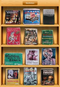
Another poignant and funny series of three works on display are by Jean Lowe. The three works “Life Style” (2013), “Food & Wine” (2013), and “Nonfiction” (2013) consist of authentic looking library magazine racks. Each has been thematically populated with periodicals rendered in her iconic painting style that appears casually rendered. In the rack “Life & Style,” one of the journals is titled “Militant Feminism” and features a cover image of the Paleolithic carved nude female figurine that is commonly misidentified with the non-contextual and sexist title “Venus of Willendorf.” It is utter deadpan irony.

Jean Lowe, “Nonfiction,” 2013.
Casein and inkjet monoprint on poly-metal; 54″ x 37-1/2″. (Unique).
© Jean Lowe. Photo courtesy Quint Gallery.
In Lowe’s rack “Nonfiction,” there are laughable periodicals such as “The Latrine Experience by Chad Norquist” and the especially devilish journal “Foundations of String Theory” that features a cover image of a woman’s buttocks virtually busting out from a thin black string bikini bottom—this is my favorite fake magazine cover of all! These three artworks due to their authentic looking racks and fake magazines with their adroit titles and unexpected image relationships are serious yet wickedly bemusing. The success of the three works is created by the play between the overly serious looking racks themselves and complementary waiting to be read imitations journals wreaking with biting irony. These three faux-magazine racks are some of the most successful artworks by Lowe that I have ever enjoyed as both a perpetual viewer and as an art reviewer of her work.
Totally different and equally enjoyable to gaze upon are four small paintings on paper made from acrylic, oil, and the mineral mica created by Jessica McCambly. Each of her four paintings feature what look like just one or two tiny, carefully laid chromatic white brushstrokes painted upon larger squares of paper. Each small brushstroke has enormous presence due their deft placement and slightly irregular surfaces that are akin to miniature mountain ranges. The silicate-structured mineral has been crushed and meticulous applied in tiny amounts to make the mica appear like gilded snow on each tiny mountaintop.
McCambly’s painting “CM(S)-1” (2015) features two side-by-side shimmering luminous whitish square postage-stamp size strokes with a just a sprinkle of the crushed mica on each brushstroke’s microscopic protruding summit. The two side-by-side strokes look like tiny isolated alpine terrains studded with the last spring remnants of gilded snow. Each tiny painting is captivating, luscious, and serene due to both the materials used and the quiet aura they generate when viewed from the intimate distance required to see their delicate details.
John Oliver Lewis, McCambly’s husband, employs awkward ceramic shapes that he then colors with various hue combinations of acrylic paint. He uses precise discordant hue combinations such as cold lime-green together with varying chromas and wavelengths of violet, dirty reds, and mucky warm browns. In his larger scale works (two to three-feet tall), the textures of his ceramic substructures are a mélange of contrasting textures.
Lewis seems to be to be intentionally creating organic shapes derived from an antithetical interpretation of Donald Judd’s early 1960s cadmium red rectilinear sculptures with intentionally removed portions, which were created purposely to defy easy description. Reinforcing this notion are the subversive textures and hues employed in Lewis’s larger works. His “Whip Top” (2012) consists of two clumsy legs supporting a glopping ooze formation that is painted similarly to varying layered flavors of sherbet smothered in ketchup. The legs look like different sugar cane confections held together with bandages and wads of spat out grape chewing gum. Altogether, the work’s multitude of unpleasant contrasts make it successful.
Alternately, Lewis’s newer small scale (approximately twelve-inch high) works have similar characteristics but become charming as their overall mases and shapes include more positive and negative space. His “Sneak Peak” (2015) is a heavy black mass topped with physical rings painted in differing values and hues of violet and yellow-green from which a black elephantine trunk extends outward and flaccidly back down to the sculpture’s base. Even when using his standard vocabulary of acrylic hues, the smaller artworks retain Lewis’s preference for awkwardness but also allow for more flattering mass relationships.
Richard Keely, the other sculptor in the exhibition, also creates difficult to describe objects. He uses a multitude of materials, and all his works are suspended from the wall. Keely’s work explores and exploits the differences of visual and physical textures by employing everything from wood glue, plywood, real silver, steel, to plush velvets. He also pushes the unfathomable boundaries of what many substances can do and also harvests within a single work all its potential delicacy and physical strength.
One such untitled work from 2015 appears like a small wastepaper basket defying gravity sitting on the wall. From the side, its base is made of layers of plywood, cement, and plate steel from which many thin metal rods jut forward to be brutally riveted onto the delicate top silver rim of the wastebasket shape. Suspended within the cavity of the basket is an incredibly smooth yellow lining made implausibly from dried yellow carpenter’s glue. When looking either outside upon or directly into the eerie yellow glue lining, there is nothing that betrays how Keely created it. Over and over Keely’s works create mysterious enchantment in the viewer.
Kara West’s curatorial agenda falters with the inclusion of only a sole work by Anna O’Cain (Keely’s spouse). O’Cain’s installation “Nighttime” (2015) is inspired by her deceased mother, Katherine Wright O’Cain Hunter. The artwork is not functionally readable by a viewer. It is not the artist’s fault because O’Cain’s intensely personal artwork can only be decoded when two or more her works are nearby to allow a viewer to compare each work’s similarities. Like the “Rosetta Stone,” O’Cain’s work must be deciphered to fully appreciate her unique visual language. It seems as if the curator does not comprehend how O’Cain’s artworks actually communicate. As plopped into this exhibition, O’Cain and her solitary work are treated unfairly by West’s curatorial effort.
Paintings created by Kim MacConnel, Jean Lowe’s spouse, consist of four separate enamel on wood paintings from his “Dove” series (2012). They have been installed abutted into a single horizontal unit. The designs of each individual panel have a nice rhythm and the intense saturation of his enamel paint is visually seductive. As installed, they almost become a palindrome. Although, the right most side of MacConnel’s installation becomes jarring. The erratic inability to recognize a repetition of similar forms on both the left and right side ruins what might have been a visual delight. This is where a stronger curatorial hand might have salvaged a might have been delight.
As curated by Kara West, the library’s Arts and Culture Exhibition Manager, the exhibition’s only common thread is marriage. As West has engaged the idea of marriage in such a discriminating way, her curatorial credentials for cultural inclusiveness become suspect. Another problem is the overt similarity of the careers of the included artists.
The artist couple Jean Lowe and Kim MacConnel each already have widespread international reputations, and the careers of both couples Debby & Larry Kline as a team and Jessica McCambly and John Oliver Lewis as individuals are in light-speed ascension. I am disappointed in the curator for seeming to create an exhibit adapted from an outdated movie script set in small middle-America featuring Judy Garland and Mickey Rooney when they gather their pals and “put on a show.”
“Significant Others” opened 19 December 2015 and runs until 28 February 2016 in the Art Gallery on the 9th Floor of the Central San Diego Central Library.
(C) 2016 by Kraig Cavanaugh.


Kraig Cavanaugh lectures about art history—specializing in Modern & Contemporary Art—as well as being an instructor of color theory, design, and studio art. He has curated numerous art exhibitions, authored exhibition catalogues, and written art reviews for several other print and online journals including “Artweek” (USA) and “Selvedge” (UK) magazines. Cavanaugh is also an invited member of the Association Internationale des Critiques d’Art (United States division), which is an NGO in official relations with UNESCO.


Just FYI Anna O’Cain’s installation is entitled “Nighttime” not “Nightmare”.
Thank you very much Ms. Nemour for alerting me to my error of the title of Anna O’Cain’s installation! It has been fixed. My apologies to Anna O’Cain. And, I thank you very much for your letting me know of my error.
Sounds unusual enough to make a trip to the library. Your descriptions are so vivid that I want to go see the exhibit.
Thank you very much, Ms. Belzer.