Naughty, Traditions, and Wood: A 2-part Review of “2015 San Diego Art Prize Exhibition”
Part 1 of 2
Voyeurism—intense looking—and insurrection are key ingredients that succeed in the current “2015 San Diego Art Prize” exhibition at La Jolla’s Athenaeum Music & Arts Library. The awardees of the 2015 San Diego Visual Arts Network’s (SDVAN) arts prize were Wendy Maruyama and Roy McMakin, who are both artists/furniture makers. Maruyama’s work overtly seduces the viewer to look at it. McMakin’s work makes you want to think about something else!
The two Arts Prize awardees were each invited to select an up-and-coming artist to exhibit alongside them for this exhibit. Maruyama controversially chose Peter Scheidt, who was a student enrolled where Maruyama teaches at San Diego State University. McMakin made a wise, surprising choice by inviting “en plein air” painter Kevin Inman.
As an exhibition, by far the biggest elephant sitting in the Athenaeum’s Clayes Gallery is Roy McMakin’s maple 48-1/2-inch tall, painted brown chest of drawers. The artwork’s only distinctive features are two drawer fronts featuring a miss-matching brown paint and a single crooked drawer pull. I even partially opened one drawer at least expecting to view exquisite dovetail joinery. Nope! Inside it was just bare wood just air-nailed together with brown putty covering each nail head. Nothing here, I thought—not until I read McMakin’s title for the dresser, “The Chest of Drawers behind James Jamesson and Jimmy Fanz in Raging Stallion Studios’ Timberwolves,” 2014. What? No recognition of the name James Jamesson registered in my mind, but “Jimmy Fanz”? Wasn’t he an actor in the popular 1990s cop show “NYPD Blue”? Wasn’t “Raging Stallion” a boxing movie that starred famed actor Robert De Niro? Why Timberwolves? I didn’t comprehend and eventually walked off thinking Gertrude Stein’s dictum: “no there there!”

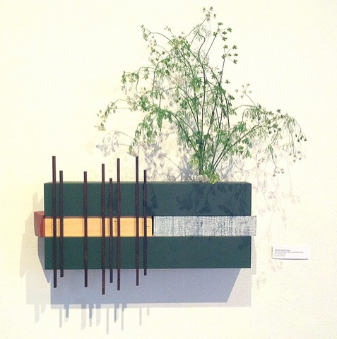
Wendy Muruyama. “The Forrest (from the Silly & Pretty Series),” 2016. Wood, paint, and glass; central mass of sculpture: 9 x 20 x 4-inches. Image (c) 2016 by Kraig Cavanaugh.
Continuing through the exhibition, I immensely enjoyed the elegant wall sculptures created by Wendy Maruyama. Each is magnificently crafted in wood composed in different layers. The raw, painted, and textured woods emphasize stability versus asymmetry. Atop each sculpture a glass vessel has been implanted, which can hold flowers. With assistance from Athenaeum director Erika Torri, it was explained to me that each sculpture is also a magic box with hidden hinged and/or sliding compartments.
The most elegant example is her shelf-like “The Forest (from the Silly and Pretty Series),” 2016. Upper and lower horizontal bands of wood painted a dark value of green sandwich both a piece of raw wood in a yellow-based hue alongside a textural whitewashed piece of wood. On the left of the nine-inch tall by twenty-inch central mass of the sculpture, Maruyama has vertically placed stub morticed thin dark wooden square dowels, which protrude above and below the work’s central mass in an both irregular heights and rhythm. Inserted on the top right side is the implanted glass vessel. As presented in this exhibition, a spray of blossoming anise was placed in the vessel. The lacey greenery on the sculpture’s right side perfectly complements the irregularly spaced square dark-value dowels in a very poetic fashion. While viewing the delicate asymmetrical balance of “The Forest,” my mind flooded with reverence that a perfect execution of both crafts of bonsai and ikebana had been executed.
After viewing Maruyama’s work, my subconscious mind immediately returned to McMakin’s title. “Raging Stallion…Timberwolves”?! What is that reference? What is that nagging feeling? Wait, wasn’t that Di Nero film actually called “Raging”-something else? “Raging…”? “Raging Bull”—that’s it! I knew I was still missing much about the ideas behind McMakin’s title!
I then proceeded to view the paintings executed by Kevin Inman—the up-and-coming artist chosen by McMakin. Inman paints en plein air (painting outdoors) views instead of composing and painting his works in the studio. His paintings also are semi-abstracted. His pronounced confident brushwork is similar to the late 19th-century painter Cezanne. The paintings’ coloration are also mostly bold similar to van Gogh and his Fauvist (wild beast) followers. Inman’s images mostly fit the traditional academic genres of landscape and still life painting. His landscapes include seascapes, cityscapes, and “suburban-scapes.” While the his more traditional landscapes and still lifes are prosaic, Inman’s “suburban-scapes” are visually arresting as they feature more intriguing and unexpected compositions.
Of the two better examples on display, one is Inman’s “Termite Tented Motel,” 2015. The small five by seven-inch canvas becomes virtually nonobjective as the loud hues of orange and blue depicting the razzle-dazzle stripes of termite exterminator’s tarps covering a building occupy most of the painting. While, it was something actually seen, composed, and painted in the field; the painting actually manages to float between an empirical plein air scene and geometric abstraction that “pushes and pulls” the space a la Hans Hofmann. The realization that this complex hybrid composition occurred on-the-fly in the field adds more intriguing fuel to the painting’s fascinating image.

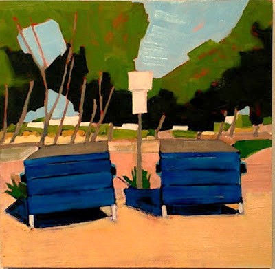
Kevin Inman. “Dumpsters at at Sunset Cliffs Parking Area,” 2016. Oil on panel; 16 x 16-inches. Image courtesy of SDVAN.
Inman’s second suburban-scape success is his larger sixteen-inch square painting “Dumpsters at the Sunset Cliffs Parking Area,” 2016. Here, the artist manages to make two mundane blue trash dumpsters sitting on the ground become monumental and sensuous. His lush layering of the paint creates the sensuousness because in the foreground violets-blues were first laid down as the shadow color, then cobalt blues painted the proceeding layer render the dumpsters. Then tinted tones of yellow-orange cadmiums were painted as the topmost layer that depicts the ground upon which the trash containers sit. While a perfect formula to prevent the paint from eventually cracking, the under painted violet-blues can still be sensed through the top most layers of the warmer yellow-orange hues. Besides the humorous and unexpected subject and glorious color, the physical painted surface is visually luxurious, too, due to Inman’s bold brush strokes created by stiff bristle brushes used to it. Together, color, brushwork, and subject create a visual delight.
After viewing Inman’s paintings, McMakin’s title again dogged me! Who is James Jammeson? It almost seems related to a comic book character. Could it be a superhero’s real identity akin to a Clark Kent or Bruce Wayne? Is it one those X-men characters—what is the character’s real name with those laser beams for eyes? Why was McMakin’s title bugging me so much? Wait a minute, “Raging Stallion”? “Raging Stallion Studios’”? Is it a movie company? Wait! Wasn’t there also some male fashion model who stirred up a controversy? What was his name? Benjamin Franklin? No. Benjamin Liberty Bell? No, Benjamin Belfry or something like that. Yah! What was the controversy? He was in the press for something. Was it a press thing or a tabloid scandal thing? Did he have something to do with a photo/art event in L.A,? Why would I know that name? Hmm? I wrote a note to research about him later as it might have something to do with McMakin’s title.
Next up, furniture artist Peter Scheidt, who was invited to exhibit by Maruyama, offers a bicycle and four wooden chairs. Two of the four chairs have been repurposed and the other two restored. The bicycle has been converted to a miniature woodshop specializing in the production of wooden spoons made from salvaged lumber. As part of the exhibition, the artist will be making spoons at the Athenaeum during a few Saturdays during the exhibition.
The repurposed chairs are those old wood school chairs that make one sit up straight and keep you awake from discomfort. Scheidt’s “Single Chair Seating Chest (green)” (2015) has had its seat cut and hinged so it can flip-open. Under the seat, a storage box had been attached with one side painted fluorescent green. If found in a Jerome’s Furniture showroom it would be placed in the “functional furnishings category.” In an art gallery, one only wonders why one side of the storage box is painted florescent green.

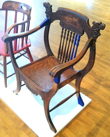
Peter Scheidt. “Oak Chair Repair (Blue),” 2015. Found chair and salvaged wood; 24 x 20 x 36-inches. Image (c) 2016 by Kraig Cavanaugh.
Of the two restored chairs, the most interesting is a mass produced Edwardian era neo-gothic revival lion chair featuring a back with a heraldic composition of two lions facing in opposing directions. It also has requisite paw arms and feet. This chair is referred to by Scheidt as “Oak Chair Repair (blue),” 2015. It was observably salvaged in Humpty Dumpty broken condition with missing rear spindles, broken joinery, and worn feet. Scheidt has repaired the chair and any losses or repairs the artist made are painted a complementary cobalt blue. Certain repairs like the replaced back spindles are not exact matches to the originals and seem clumsily cannibalized from elsewhere. The under seat support repair is similarly crude, but the fixed losses to the feet and the areas of joinery reattaching the arms to the chair are more expertly done.
Again in a gallery or museum context, the question is if this chair is still just a chair or is it something else? In a context of responsible restoration, repairs of artifacts should be made clearly obvious. Scheidt has made his repairs overly obvious, which might make the chair art. Although, the original chair and original design still remain the central focus and subject of the object and its visual interest. Therefore, in my mind, Schiedt has not created a new artwork, nor a post-modern work, so I consider Scheidt to be just an overly conscientious restorer of chairs.
Again, I was drawn back to McMakin’s brown painted elephant of drawers. I looked back over the object—I had not missed anything. Then, I went back to the title. Flash of light! Raging Stallion Studios—that sounds like a company that makes adult films! Might Roy McMakin’s “The Chest of Drawers behind James Jamesson and Jimmy Fanz in Raging Stallion Studios’ Timberwolves” refer to the adult film industry or maybe even an actual film? If so, is it an actual film or a fictitious film—that would make a huge difference in its meaning.
Later, I eventually found the answer online!

A cropped publicity image of model James Jamesson from the movie “Timberwolves,” 2013. Directed by Steve Cruz. Original publicity image photographed by Kent Taylor. Image and movie © 2013 by RagingStallion.com. (Available on DVD. Scene download available at http://store.falconstudios.com/products/. Available for streaming membership on http://ragingstallion.com).
But with this new information, McMakin’s artwork suddenly howled with a new set of aesthetic and intellectual ramifications! A question posited by feminist artist Mary Kelly immediately came to mind: “What is the signified and with what political consequences?” 1
(To be continued…)
- Kelly, Mary. “Imaging Desire.” Cambridge, Mass: MIT Press, 1998. p. 10.
[The author is grateful to RagingStallion.com and their Vice President of Marketing Toby J. Morris for permission to use a cropped portion of the studios’ original publicity image].
the “2015 San Diego Art Prize Exhibition” runs from 7 May through 11 June 2016.
(c) 2106 by Kraig Cavanaugh.
Stay tuned for Part 2 of the upcoming, continuing saga about the “2015 San Diego Art Prize Exhibition.”
In Part 2 of the art review, art critic Kraig Cavanaugh discusses the artistic importance and major consequence of Roy McMakin’s chest of drawers and also addresses the San Diego Art Prize’s actual impact upon the precarious dilemma facing the San Diego region’s fine art community.

Kraig Cavanaugh lectures about art history—specializing in Modern & Contemporary Art—as well as being an instructor of color theory, design, and studio art. He has curated numerous art exhibitions, authored exhibition catalogues, and written art reviews for several other print and online journals including “Artweek” (USA) and “Selvedge” (UK) magazines. Cavanaugh is also an invited member of the Association Internationale des Critiques d’Art (United States division), which is an NGO in official relations with UNESCO.


